Friday, June 6, 2014

Violet/Yellow Complimentary Value study

Continuing on with the series on complimentary value studies. Last night was violet and it's compliment yellow.

Color palette included:
Deep Violet
Primary Yellow
Titanium White
Mars Black

All photos are Liquitex Acrylic paint shot with a Samsung Galaxy S III smartphone.


Violet/Yellow Complimentary Value study - June 5, 2014 (18x24)

Thursday, May 29, 2014

Blue/Orange Complimentary Value study

I want to begin my next series of color theory/color scheme studies with compliments, but since I almost never work exclusively with pure, undiluted color I'm making sure to include that these are also value studies.

I feel cadmium orange is too red so I now "cut" it with primary yellow to get what I think is a better orange to work with.

Color palette included:
Primary Blue
Cadmium Orange Hue
Titanium White
Mars Black
Primary Yellow

All photos are Liquitex Acrylic paint shot with a Samsung Galaxy S III smartphone.


Blue/Orange Complimentary Value study - May 28, 2014 (18x24)

Wednesday, May 28, 2014

Yellow Split Complimentary study

Finished off the series. Yellow with it's split compliments violet-red and violet-blue.

Color palette included:
Primary Yellow
Titanium White
Mars Black
Deep Violet
Primary Blue
Naphthol Crimson

All photos are Liquitex Acrylic paint shot with a Samsung Galaxy S III smartphone.


Yellow Split Complimentary study - May 26, 2014 (18x24)

Tuesday, May 13, 2014

Orange Split Complimentary study

Orange with it's split compliments - blue green and blue-violet. About 2 hours of work. Tonight with finish the split complimentary series with yellow.

Color palette included:
Cadmium Orange Hue
Titanium White
Mars Black
Primary Blue
Phthalocyanine Green
Deep Violet

All photos are Liquitex Acrylic paint shot with a Samsung Galaxy S III smartphone.


Orange Split Complimentary study - May 12, 2014 (18x24)

Friday, May 9, 2014

Red Split Complimentary study

Red split complimentary study using green-yellow and green-blue as the split compliments. About 3 hours of work but not quite finished - but considering it to be close enough.

Makes me think of a watermelon....

Color palette included:
Naphthol Crimson
Titanium White
Mars Black
Phthalocyanine Green
Primary Yellow
Primary Blue

All photos are Liquitex Acrylic paint shot with a Samsung Galaxy S III smartphone.


Red Split Complimentary study - May 8, 2014 (18x24)

Tuesday, May 6, 2014

Violet Split Complimentary study

Third in the series and I'm happy with what I learned. I feel like I should add more violet but I'll leave it as is.

All the cool colors are done - off to the warm colors tonight.

Color palette included:
Deep Violet
Titanium White
Mars Black
Primary Yellow
Phthalocyanine Green
Cadmium Orange Hue

All photos are Liquitex Acrylic paint shot with a Samsung Galaxy S III smartphone.


Violet Split Complimentary study - May 5, 2014 (18x24)

Saturday, May 3, 2014

Green Split Complimentary study - unfinished

For the second day in a row I was unable to bring a study I was working on to a satisfying conclusion. I got started late into the evening - 8 pm both nights - and stopped working at 10 pm. Two hours just won't cut it. Some times I'm focused and the process develops quickly - I have good paintings done in one hour - but most of the time I need the four hours I prefer to spend painting to get close to an acceptable conclusion. This evening I studied green with violet-red and orange red as the split complimentary colors.

Color palette included:
Phthalocyanine Green
Titanium White
Mars Black
Naphthol Crimson
Cadmium Orange Hue
Deep Violet

All photos are Liquitex Acrylic paint shot with a Samsung Galaxy S III smartphone.


Green Split Complimentary study - May 2, 2014 (18x24)

Friday, May 2, 2014

Blue Split Complimentary study - unfinished

Back to painting again in the evenings, I have decided to study split complimentary painting - which is taking a color and the two colors adjacent to its compliment. In this case I took blue and studied it against yellow-orange and orange-red (the two colors adjacent to orange - which is blue's compliment). Unfortunately I only got two hours of work exploring, but I'll post it anyway, as I'm not afraid to show bad or incomplete work.

Color palette included:
Primary Blue
Titanium White
Mars Black
Naphthol Crimson
Cadmium Orange Hue
Primary Yellow

All photos are Liquitex Acrylic paint shot with a Samsung Galaxy S III smartphone.


Blue Split Complimentary Study, May 1, 2014 (18x24)

Friday, March 21, 2014

Orange Tonal Study - Video


A short 2 and 1/2 hour color theory exploration into orange tonal colors. Liquitex Acrylic paint shot with a Samsung Galaxy S III smartphone in recording mode.

Orange Tonal Study

I think this is the last in the series. Perhaps I'll do a black and a white tonal study but I think I have done studies that are similar enough to move forward. Working with a cadmium orange hue - I think it's too red - so I add a small amount of primary yellow to get the orange I want.

Color palette included:
Cadmium Orange Hue
Primary Yellow
Titanium White
Mars Black

All photos are Liquitex Acrylic paint shot with a Samsung Galaxy S III smartphone.


Orange Tonal Study - March 20, 2014 (18x24)

Wednesday, March 19, 2014

Violet Tonal Study - Video


A short 2 and 1/2 hour color theory exploration into violet tonal colors. Liquitex Acrylic paint shot with a Samsung Galaxy S III smartphone in recording mode.

The battery was almost dead halfway through the painting so I was unable to record to the end.

For more information on me and my studies in painting please visit my blog http://paintingwithacrylics.blogspot.com/

Violet Tonal Study

Turned out "ok". I think I have a few more tonal studies to do before I move on to whatever I decide to do next.

Color palette included:
Deep Violet
Titanium White
Mars Black

All photos are Liquitex Acrylic paint shot with a Samsung Galaxy S III smartphone.


Violet Tonal Study - March 17, 2014 (18x24) 

Monday, March 17, 2014

Green Tonal Study - Video


A short 1 and 1/2 hour color theory exploration into green tonal colors. Liquitex Acrylic paint shot with a Samsung Galaxy S III smartphone in recording mode.

The battery was almost dead halfway through the painting so I was unable to record to the end.

Green Tonal Study

Meh. I did a video but the battery ran low before I could finish. I'll still post it though.

Color palette included:
Phthalocyanine Green
Titanium White
Mars Black

All photos are Liquitex Acrylic paint shot with a Samsung Galaxy S III smartphone.


Green Tonal Study - March 15, 2014 (18x24)

Tuesday, March 11, 2014

Red Tonal Study - Video


A short 2 and 1/2 hour color theory exploration into red tonal colors. Liquitex Acrylic paint shot with a Samsung Galaxy S III smartphone in recording mode.

For more information on me and my studies in painting please visit my blog http://paintingwithacrylics.blogspot.com/

Red Tonal Study

Red tonal study. For some odd reason I keep putting paint on my palette that I'm not using. I need to buy air-tight containers to put the paint since I can't put it back in the tube after it comes out. Perhaps I can buy Basics out of a jar. That would be nice.

Color palette included:
Naphthol Crimson
Titanium White
Mars Black

All photos are Liquitex Acrylic paint shot with a Samsung Galaxy S III smartphone.


Red Tonal Study, March 10, 2014 (18x24)

Wednesday, March 5, 2014

Yellow Tonal Study - Video


A short 2 and 1/2 hour color theory exploration into yellow tonal colors. Liquitex Acrylic paint shot with a Samsung Galaxy S III smartphone in recording mode.

For more information on me and my studies in painting please visit my blog http://paintingwithacrylics.blogspot.com/

Yellow Tonal Study

Got back into tonal studies - this time with yellow. Decided to use orange with yellow and black to make my brown.

Color palette included:
Primary Yellow
Cadmium Orange Hue
Titanium White
Mars Black

All photos are Liquitex Acrylic paint shot with a Samsung Galaxy S III smartphone.


Yellow Tonal Study, March 3, 2014 (18x24) 

Saturday, March 1, 2014

Yellow Study - Video


A short 2 and 1/2 hour color theory exploration into the color yellow against orange, red and blue. Liquitex Acrylic paint shot with a Samsung Galaxy S III smartphone in recording mode.

Yellow Study

This didn't work out too well. Not much to say about it.

Color palette included:
Primary Yellow
Cadmium Orange Hue
Naphthol Crimson
Primary Blue
Titanium White
Mars Black

All photos are Liquitex Acrylic paint shot with a Samsung Galaxy S III smartphone.


Yellow Study, February 28, 2014 (18x24)  

Blue Complimentary-Analogous Study - 3 - Video


Liquitex Acrylic paint shot with a Samsung Galaxy S III smartphone in recording mode. Decided to spend one more night on this theme.

Friday, February 28, 2014

Blue Complimentary-Analogous Study - 3

The past few nights I have been working with a loaded brush that I don't clean in-between colors and that is where the muddiness in these recent paintings is coming from. I also did a video while I painted. Will upload that in a separate post linked to my YouTube Channel - Stephen Jensen.

I'm going to stop doing that.

Color palette included:
Primary Blue
Primary Yellow
Cadmium Orange Hue
Naphthol Crimson
Titanium White
Mars Black

All photos are Liquitex Acrylic paint shot with a Samsung Galaxy S III smartphone.


Blue Complimentary-Analogous Study - 3, February 27, 2014 (18x24) 

Thursday, February 27, 2014

Blue Complimentary-Analogous Study - 2 - Video


My first video of my painting process done with Liquitex Acrylic paint shot with a Samsung Galaxy S III smartphone in recording mode. The painting is a study of color theory taking blue and the analogous colors across from it on the color wheel and exploring how they work together - and working abstractly is a great way to focus on the colors.

As I work on my studies I find I sometimes over-work the image and lose good stopping points when the painting isn't finished but it has come as far as I should take it. Being able to see a video of the painting process may help me to identify better where it all goes wrong and I lose the work I did. However, I'm not one to give up on an image. I have many images waiting for me to salvage them and a few I actually did save. Some however are beyond saving and end up in the trash (dramatic music playing in the background).

I had some problems setting up the smartphone in a jury-rigged Dynex mobile device mount. The mount was loosely clamped to a wood yard stick spanning two travel totes - which straddled the painting. Every time I moved, got up or breathed it shook. Anyway, this is my first time and I'll try to get it right next time.

I have to figure out something better.

Blue Complimentary-Analogous Study - 2

I wanted to do a painting and a video of my process. I'll put the video in my next post from YouTube.

I start with the canvas pad flat on a table. As I go where I feel the paint is too wet or I want to get a look at it from another angle I'll pick it up and view it in a mirror so I can see the reverse. Reversing the image helps to identify problems with colors - sometimes a color is spread too thin, is too bright, too dark, too... something... Reversing the image also helps to identify balance issues. When I first started out studying painting in college many years ago an instructor showed the class a trick to see balance issues. He said we should look at our painting in a large mirror. The reverse image we'd see would show if the subject we were painting was tilting - and there I saw it. Many of my paintings of nudes, still-lifes and landscapes were tilting all the same way.

So now a part of my process is to pick the painting up and look at it in a large mirror to help me prevent the tilting. And every once in a while when I read a favorite art magazine I'll see an artist who obviously doesn't do this. Their loss.

Color palette included:
Primary Blue
Primary Yellow
Cadmium Orange Hue
Naphthol Crimson
Titanium White
Mars Black

All photos are Liquitex Acrylic paint shot with a Samsung Galaxy S III smartphone.


Blue Analogous Study - 2, February 26, 2014 (18x24)

Wednesday, February 26, 2014

Black Study

I did this earlier this month, but can't remember the date so I'll date it as February 2014 and leave it at that. I know it isn't a successful attempt, but I promised myself I'd put everything I've done up - whether it is good or not. After all I'm not trying to make a living at this. I'm just exploring painting.

There were points in the painting that showed promise, that showed I was taking the right direction. Sometimes I think I should use the recording feature of my phone and do videos of the paintings as I progress so we can see how my process progresses. Perhaps I will do that.

Color palette included:
Mars Black
Primary Yellow
Cadmium Orange Hue
Naphthol Crimson
Primary Blue
Deep Violet
Phthalocyanine Green
Titanium White

All photos are Liquitex Acrylic paint shot with a Samsung Galaxy S III smartphone.


Black Study, February 2014 (18x24)

Blue Tonal Study

I decided to continue with the colors I had selected for my last painting Blue Complimentary-Analogous Color Study. But as I progressed I worked more toward keying on blue and using colors with blue as opposed to including them as separate tonal explorations in the same painting. I think the next tonal study I need ensure more than one color is explored. This "blue" study is very boring.

Color palette included:
Primary Blue
Cadmium Orange Hue
Primary Yellow
Naphthol Crimson
Mars Black
Titanium White

All photos are Liquitex Acrylic paint shot with a Samsung Galaxy S III smartphone.


Blue Tonal Study, February 25, 2014 (18x24)

Tuesday, February 25, 2014

Blue Complimentary-Analogous Color Study

Challenging myself by selecting a primary color - blue - and taking it's complimentary color - orange - with the analogous color next to it, yellow, yellow-orange and orange-red, red. This represents about three hours worth of study. There's always some tonal study (a color's gray-scales) and perhaps I should do a tonal study tonight - all gray-scale. And perhaps tomorrow night I'll do one painting without using lines. I'll just do huge swatches of color.

Should be fun!

Color palette included:
Primary Blue
Cadmium Orange Hue
Primary Yellow
Naphthol Crimson
Mars Black
Titanium White

All photos are Liquitex Acrylic paint shot with a Samsung Galaxy S III smartphone.


Blue Complimentary-Analogous Color Study, February 24, 2014 (18x24)

Friday, February 21, 2014

No Black or White study with Blue

This will be the last of the "no black or white" studies.Even if I'm showing "Some" understanding of how to work without black or white it only works with the warm colors - red, orange and yellow. The cool colors - green, blue and violet are too dark. This began as a study in blue but it was too dark and screamed for something to lighten the blue - and that, usually, is white.

Color palette included:
Primary Yellow
Cadmium Orange Hue
Naphthol Crimson
Primary Blue

All photos are Liquitex Acrylic paint shot with a Samsung Galaxy S III smartphone.


No Black or White study with Blue - February 20, 2014 (18x24)

Wednesday, February 19, 2014

No Black or White study with Yellow

Decided to remove the use of black or white from my palette Monday night and make my key focus color yellow. I wanted to remove my dependence on black and white to see if I could pull colors together and make them work. So far... not so much...

I started with yellow - adding orange and red straight from the tube and in small amounts, mixed in with the yellow. Purple comes in as the compliment I can use to make a brown to help separate colors, but then things went off track when I added green and blue - just too many colors! Near the end of the night I ended up with the orange fighting too much for attention. Oh well, I knew that was happening and I let it happen. I think I'll do a "no" black or white study with blue tonight and see what happens.

Color palette included:
Primary Yellow
Cadmium Orange Hue
Naphthol Crimson
Primary Blue
Deep Violet
Phthalocyanine Green

All photos are Liquitex Acrylic paint shot with a Samsung Galaxy S III smartphone.


No Black or White study with Yellow - February 17, 2014 (18x24) 

Friday, February 14, 2014

February 7, White Study

I've been preoccupied with my job search (not going so well but I'm not giving up).

Evenings, when I do my painting, I'm very discouraged about my career outlook so I don't paint. I've gotten too "down" about these things. I'm thinking and worrying too much and it needs to stop! Late in posting this study from last week. I've gotten lax in my painting and posting. Time to stop this.

Decided to do more work with just white. Didn't turn out too well so I won't say much more.

Color palette included:
Titanium White
Mars Black
Primary Blue
Deep Violet
Phthalocyanine Green
Naphthol Crimson
Primary Yellow
Cadmium Orange Hue

All photos are Liquitex Acrylic paint shot with a Samsung Galaxy S III smartphone.


White Study - 2, February 7, 2014 (18x24)

Tuesday, February 4, 2014

Black and White Study

Took a break from working with analogous color studies for one night. I didn't spend more than two hours on it but I should have spent more.

Color palette included:
Titanium White
Mars Black
Naphthol Crimson
Primary Yellow
Cadmium Orange Hue

All photos are Liquitex Acrylic paint shot with a Samsung Galaxy S III smartphone.


Black and White Study, February 3, 2014 (18x24)

Tuesday, January 28, 2014

White Key Color Study - 2

Decided to do another key color with white - since the first one turned out so bad. This time I worked with 3 accent colors - blue, violet and green - but as the painting progressed I brought a fourth and fifth color, yellow and orange, into the mix.

Color palette included:
Primary Blue
Deep Violet
Phthalocyanine Green
Primary Yellow
Cadmium Orange Hue
Titanium White
Mars Black

All photos are Liquitex Acrylic paint shot with a Samsung Galaxy S III smartphone.


White Key Color - 2, January 27, 2014 (18x24)

Sunday, January 26, 2014

Black Key Color Study

Friday night I began work on a Black Key Color Study using blue, green and violet as the colors I would mix black with - my key focus color. About an hour into painting I realized a minor problem. No matter how much color I loaded up my brushes with I wasn't getting very good coverage. What I mean is when I made a brush stroke, whether my intention was to completely cover over the surface or another color - replacing it completely with the new color - it didn't work very well. It was if I was painting on the back, unprimed surface of a canvas. So guess what... I was painting on the back, unprimed surface of the canvas pad.

I considered starting over with a new canvas pad or maybe even flipping the canvas pad over to the correct side and starting over. Instead I decided to continue the wrong side (ala Francis Bacon) and finish what I started.

So here it is. Pretty bad. Couldn't really do any better.

Color palette included:
Primary Blue
Deep Violet
Phthalocyanine Green
Titanium White
Mars Black

All photos are Liquitex Acrylic paint shot with a Samsung Galaxy S III smartphone.


Black Key Color Study, January 24, 2014 (18x24)

Thursday, January 23, 2014

Analogous Warm Colors Study, Y, Y-O, O, O-R, R

Worked on the other side of the color wheel with warm analogous colors - yellow, yellow-orange, orange, orange-red, red. I think it turned out well.

Perhaps I'll try 3 analogous colors next.

Color palette included:
Primary Yellow
Cadmium Orange Hue
Naphthol Crimson
Titanium White
Mars Black

All photos are Liquitex Acrylic paint shot with a Samsung Galaxy S III smartphone.


Analogous Warm Cool Study, Y, Y-O, O, O-R, R, January 22, 2014 (18x24)

Tuesday, January 21, 2014

Analogous Cool Colors Study, V, B-V, B, B-G, G, Unfinished

My first two analogous color studies didn't work out so well, but I think I understand why. First, there was no one dominate color with subordinate colors. The colors were used as equals and when colors are used that way they tend to fight each other.

With this study the green started overwhelming the blue, blue-green, blue-violet and violet so I decided to develop green as the dominant color leaving the others to either be subordinate or accent colors.

I think with more time this would have been really cool... get it?... ..."cool"...

Color palette included:
Deep Violet
Primary Blue
Phthalocyanine Green
Titanium White
Mars Black 

All photos are Liquitex Acrylic paint shot with a Samsung Galaxy S III smartphone.


Analogous Cool Colors Study, V, B-V, B, B-G, G, January 20, 2014 (18x24)

Saturday, January 18, 2014

January 17, 2014 Analogous Color Study, B, BV, V, VR, R

Didn't come out so well. I picked 5 analogous colors - blue, blue-violet, violet, violet-red, and red. Moving on...

Color palette included:
Primary Blue
Deep Violet
Naphthol Crimson
Titanium White
Mars Black

All photos are Liquitex Acrylic paint shot with a Samsung Galaxy S III smartphone.


January 17, 2014, Analogous Color Study (18x24)

Thursday, January 16, 2014

January 15, 2014, Analogous Color Study - G, YG, Y, YO, O

Decided to move onto working analogous colors last night and decide green, yellow-green, yellow, yellow-orange, and orange would be the five analogous colors I'd work with. I know we can work with fewer and perhaps tonight I'll pick three colors from another side of the color wheel and give it a go.

This was very challenging for a while, the colors quickly got away from me and I ended up green and orange competing too much for attention. Near the end of the night I finally decided to favor orange and let the green go a bit. Even though there appears to be blue added - there was no blue used.

But the orange is too overpowering.

Color palette included:
Phthalocyanine Green
Primary Yellow
Cadmium Orange Hue
Titanium White
Mars Black

All photos are Liquitex Acrylic paint shot with a Samsung Galaxy S III smartphone.


January 15, 2014, Analogous Color Study (18x24)

Tuesday, January 14, 2014

January 13, 2013, Yellow Key Color Study


This might be it for my key color studies.

I feel good about what I have accomplished with the six main colors. I've done blue, purple and green recently along with yellow (today). I did red and orange last year but didn't identify them as key color studies.

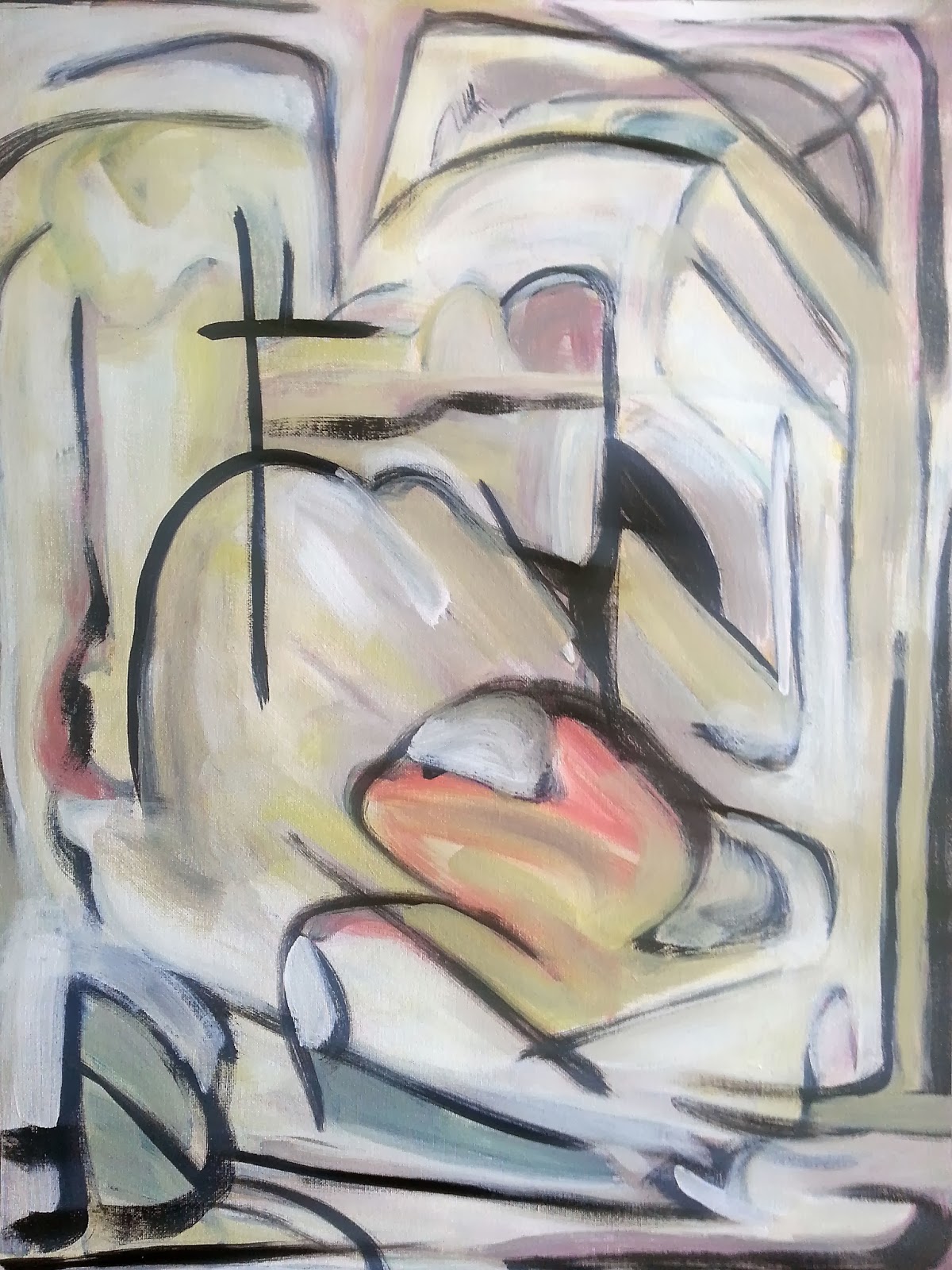
To complete Yellow Key Color Study I decided to take the complimentary - violet (instead of purple this time) and the other two primary colors - blue and red - to help balance the painting. Because this is a key color study of yellow the other pure colors are mixed in with yellow and not often will you ever see me using a pure color unless I feel it hits the spot just right. I ran out of Cadmium Yellow Medium Hue halfway through and had only tubes of Primary Yellow (which I planned to change to because I think Cadmium feels too orange).

Feels a little too orange doesn't it? Yellow when used with other colors doesn't maintain it's hue too well. It's like working with white - whatever color you mix in it, even in very small amounts, it becomes that color.

Color palette included:
Cadmium Yellow Medium Hue
Primary Yellow
Primary Blue
Deep Violet
Naphthol Crimson
Titanium White
Mars Black

All photos are Liquitex Acrylic paint shot with a Samsung Galaxy S III smartphone.


January 13, 2014, Yellow Key Color Study (18x24)

Saturday, January 11, 2014

January 10, 2014, White Key Color Study

"Meh...", is about all I can say about this. Question is, should I try another study and come up with a better resolution or should I not worry about it. Actually, I ask myself about that with every study I've done this year and last. I think where this got out of hand is from the very beginning, when I decided to use all 6 primary and secondary colors. In my more successful studies I pick fewer colors that will work well together and I allow one or two to become more dominant. The more colors you work with, the more they compete for attention and the harder finding balance becomes. That's what happened here. White Key Color Study is a study in futility. And it isn't really even white either.

Color palette included:
Titanium White
Cadmium Orange Hue
Primary Blue
Cadmium Yellow Medium Hue
Dioxazine Purple
Naphthol Crimson
Phthalocyanine Green

All photos are Liquitex Acrylic paint shot with a Samsung Galaxy S III smartphone.


January 10, 2014, White Key Color Study (18x24)

Friday, January 10, 2014

January 9, 2014, Black & White Study

Since I am working to improve my knowledge of colors and I have focused on the primary and secondary colors I decided to focus on the two that don't fit into those categories - black and white. The goal was to work with black, white and various shades of gray, seeing how I could work them against each and into each other. I honestly don't know if they are considered compliments since they aren't across from each other on the color wheel and adding certain amounts will never make brown - a key trademark of complimentary colors. Black and white are more like supporting colors used to augment the main 6 primary and secondary colors. Yet I have seen paintings by artists where, through their mastery of color, they can make black and white a color like any other. Max Beckmann (Wikipedia) comes to mind for starters...

I think I have some work to do with black and white. Perhaps I'll do a key color study of black and then one of white.

Color palette included:
Titanium White
Mars Black

All photos are Liquitex Acrylic paint shot with a Samsung Galaxy S III smartphone.


January 9, 2014, Black & White (18x24)

Thursday, January 9, 2014

January 8, 2014, Brown Compliments Study

I've wanted to try an predominantly brown painting for a while but instead of using browns from a tube I mixed my own browns from the three cool colors and their compliments. Doing this isn't as easy as it seems, though. Mixing an equal amount of two compliments doesn't make a brown but instead makes a darker version of one of the colors - usually the cool color - that is, blue, purple and green. I find the best way to make a brown is to start with a lot of the warm complimentary color - red, orange or yellow and add small amounts of it's compliment - green, blue or purple (respectively) until I get a good brown. Yet the browns are not equal. A brown from yellow/purple isn't the same as red/green or orange/blue. When I look at a pure brown from the tube I don't see the colors used to make it, I see something that has transformed into brown - and I wouldn't mind knowing the recipe.

Anyway, I used white and black to lighten or darken the colors as needed.

Color palette included:
Cadmium Orange Hue
Primary Blue
Cadmium Yellow Medium Hue
Dioxazine Purple
Naphthol Crimson
Phthalocyanine Green
Titanium White
Mars Black

All photos are Liquitex Acrylic paint shot with a Samsung Galaxy S III smartphone.


January 8, 2014, Brown (18x24)

Tuesday, January 7, 2014

January 6, 2014, Blue Key Color Study, Unfinished

Had some challenges with this study. Took me until the end of the evening to figure out how to bring orange and yellow into the painting to help set up the blue, but it was late when that happened. Since I am spending no more than one evening per painting this one will have to stay unfinished. Tonight, Tuesday, I will be too busy to paint. Will do a new painting Wednesday evening.

Color palette included:
Phthalocyanine Blue
Cadmium Yellow Medium Hue
Cadmium Orange Hue
Naphthol Crimson
Titanium White
Mars Black

All photos are Liquitex Acrylic paint shot with a Samsung Galaxy S III smartphone.


January 6, 2014, Blue Key Color Study, Unfinished (18x24)

Saturday, January 4, 2014

January 3, 2014, Purple Key Color Study

Another key color study working in purple, another color I don't feel like I have a good handle on. I think this turned out better than the Green key color study from yesterday.

Color palette included:
Dioxazine Purple
Cadmium Yellow Medium Hue
Cadmium Orange Hue
Naphthol Crimson
Titanium White
Mars Black

All photos are Liquitex Acrylic paint shot with a Samsung Galaxy S III smartphone.


January 3, 2014, Purple Key Color Study (18x24)

Friday, January 3, 2014

January 2, 2014, Green Key Color Study

I've been having problems working with the color green - tints, shades and various color combinations where green comes out dominant. So I decided to do a key color painting focusing on green to get a better handle on the color.

Not quite there yet. I plan to continue to work on green throughout the month.

Color palette included:
Phthalocyanine Green
Phthalocyanine Blue
Cadmium Yellow Medium Hue
Cadmium Orange Hue
Naphthol Crimson
Titanium White
Mars Black

All photos are Liquitex Acrylic paint shot with a Samsung Galaxy S III smartphone.


January 2, 2014, Green Key Color Study (18x24)

Thursday, January 2, 2014

January 1, 2014, Waterfall

Happy New Year!

Here's the first painting in 2014. I have to confess, it isn't finished but I have decided to spend my time moving forward from painting to painting as opposed to spending great deals of time bringing a work to completion. Last year I tried to do a painting a day but I kept getting waylaid by thinking and obsessing too much on one idea. I'd rather leave something unfinished, and move on, then spend a month trying to figure out how to finish something and then end up over-working it.

Finished last night, posted today. It's an abstraction of a waterfall.

Color palette included:
Phthalocyanine Green
Phthalocyanine Blue
Cadmium Yellow Medium Hue
Cadmium Orange Hue
Naphthol Crimson
Titanium White
Mars Black

All photos are Liquitex Acrylic paint shot with a Samsung Galaxy S III smartphone.


January 1, 2014, Waterfall (18x24)